Inspired EHRs: Designing for Clinicians
Jeff Belden, MD, the University of Missouri, funded by the National Institute of Health, and California Health Care Foundation
2013 - 2014
Role
Design Lead, Front-end engineer
Team size
1 designer
Project Length
1.5 years
Electronic health records (EHRs) were originally designed to help with medical billing, and are typically plagued with clumsy interfaces, poorly designed information hierarchy, and cumbersome workflows, all of which distance clinicians from quality patient care. In most cases, these systems are set up for failure —clinicians burnout and patients' lives are put at risk. With a team of physicians, nurses, health IT, and HCI experts, as a designer at GoInvo, I designed, coded, and became a co-author on an open source e-book to distribute ideas, designs, and techniques to health IT and EHR vendors to jumpstart EHR design on a US national level.
Problem Statement
EHRs (electronic health records) today are notoriously difficult to use, though they play a critical role in providing health care across the United States. EHRs historically lacked intuitive interfaces, usable processes, and basic readability. There’s plenty of room for improvement, informed by healthcare processes, human factors principles, and usability design. Jeff Belden, a family physician and professor at the University of Missouri, partnered with GoInvo to share this vision and inspire a change in EHR design standards. With support from the California Healthcare Foundation and the SHARP-C Project of the Office of the National Coordinator for Health IT, a team of physicians, humans factors and usability experts assembled to take on this challenge.
Process
A web-based e-book as our canvas
Together, the core team approached the project knowing the outcome would be an interactive experience to communicate our vision to a niche audience. For our very first workshop, we brought in inspiration in the form of physical books, interactive digital experiences, and e-books. An e-book was a team favorite, as it is a familiar format for our audience, easier to share with marketplaces already in place, and a low production cost. As the project evolved, we saw that an HTML-based open source format would be our most accessible way to reach our target audience, and allowed us to prototype our designs as tangible examples. The e-book, exposing how software design and national standards collide, became a lightweight design policy for electronic health records.

Workshops to explore and define core chapters and content
At GoInvo, we facilitated workshops where the team, along with select physicians, nurses, and representatives from EHR vendors, explored and defined core aspects of EHRs, forming the foundation of the book's chapters. Hyper-focused breakout groups during these workshops further sculpted the chapters into key elements, issues, and potential solutions, which the team took away, exploring design concepts and supporting detail, honing into a cohesive vision for the future of EHR design.
Writing for designers and engineers
In addition to workshop facilitation, design, and prototyping, we also contributed to the content of the book. In addition to rounds of review with test readers, our team performed iterative rounds of editing of not just designs but also text. With selective word choice and tightening of text, the team was able to convey complex clinical situations to designers and engineers in clear, concise language.
Solution
Open source designs you can touch and play with
We originally designed early versions of the e-book for Apple format, using iBooks Author to compose and iBooks to share and test the contents. As the project evolved, we saw that the web would be able to reach a much wider audience, no matter their device of choice, gave us greater control over content, interaction, updates, and allowed us to make the transition from e-book to prototyped examples as seamless as possible. We published the final product under the Apache 2.0 license.
We engineered the e-book to be easily navigable within and between chapters. Readers could skip or dig into unobtrusive tidbits we dubbed “sidebars” or refer to other chapters where we go into deeper detail on a topic without losing their place. Though we load in a number of images into each chapter, page loads wouldn’t hamper readers, and images could be blown up to view more detail. The ebook can be accessed from desktop, laptop, tablet, or your phone and is designed to be simple and lightweight for your pocket and your brain.
We designed and prototyped example components for an EHR modeled to support care provider workflows and aid decision-making, integrating them into chapters. The web-based nature of the e-book provided a seamless interactive experience for readers, giving them a taste of potential capabilities and context for clinical use, with supporting detail for how it would improve the care a clinician would provide.
Provider and patient-centered design
Because our core team was composed of physicians, nurses, and HCI experts, we could leverage their real-life experiences in our designs. We designed for, not only a provider’s thought processes, but also day-to-day tasks and workflows. By reducing cognitive overload and various interaction fatigues, we support patient safety and set the provider up to deliver the best care possible.

Focus on the patient
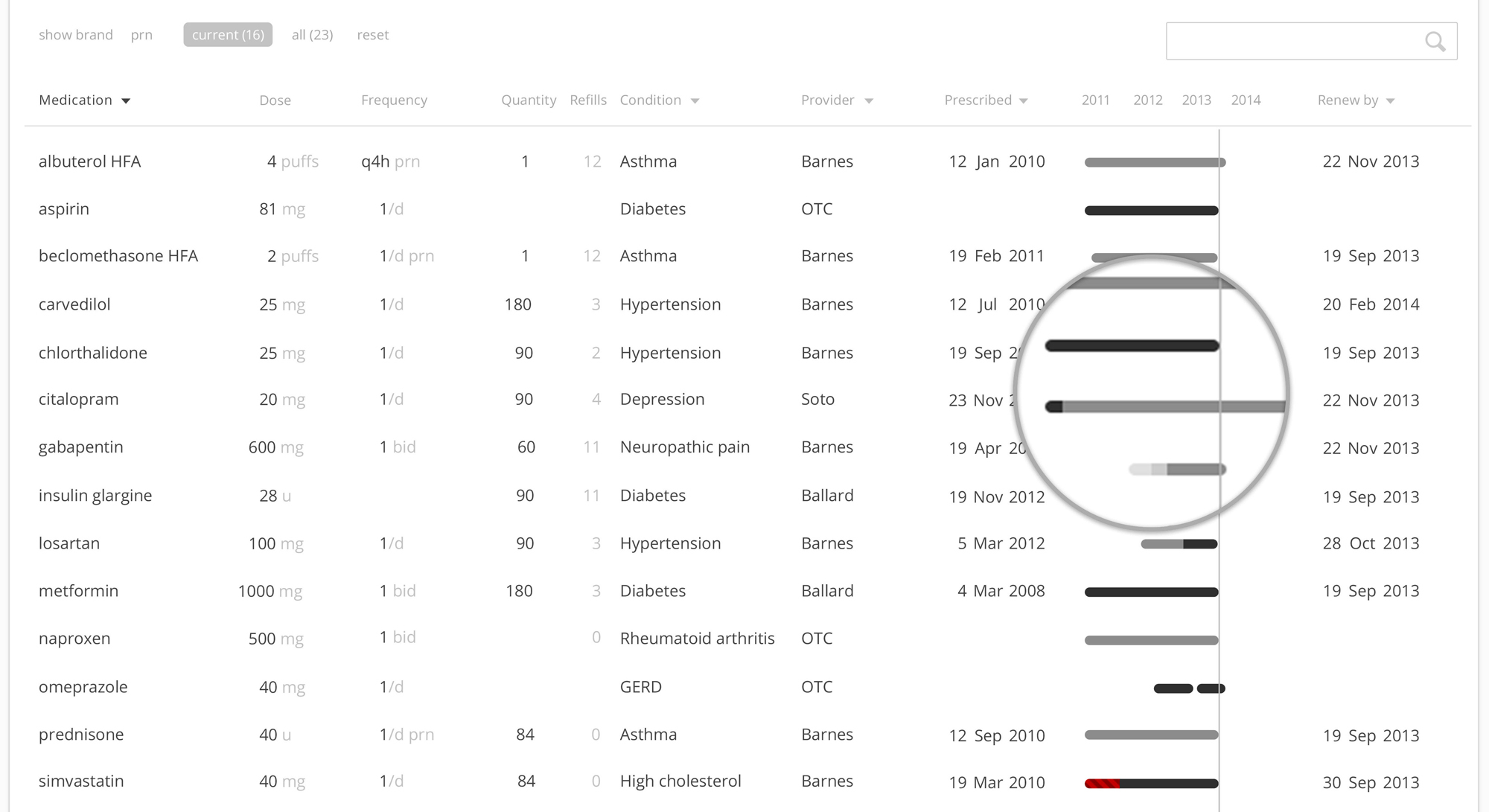
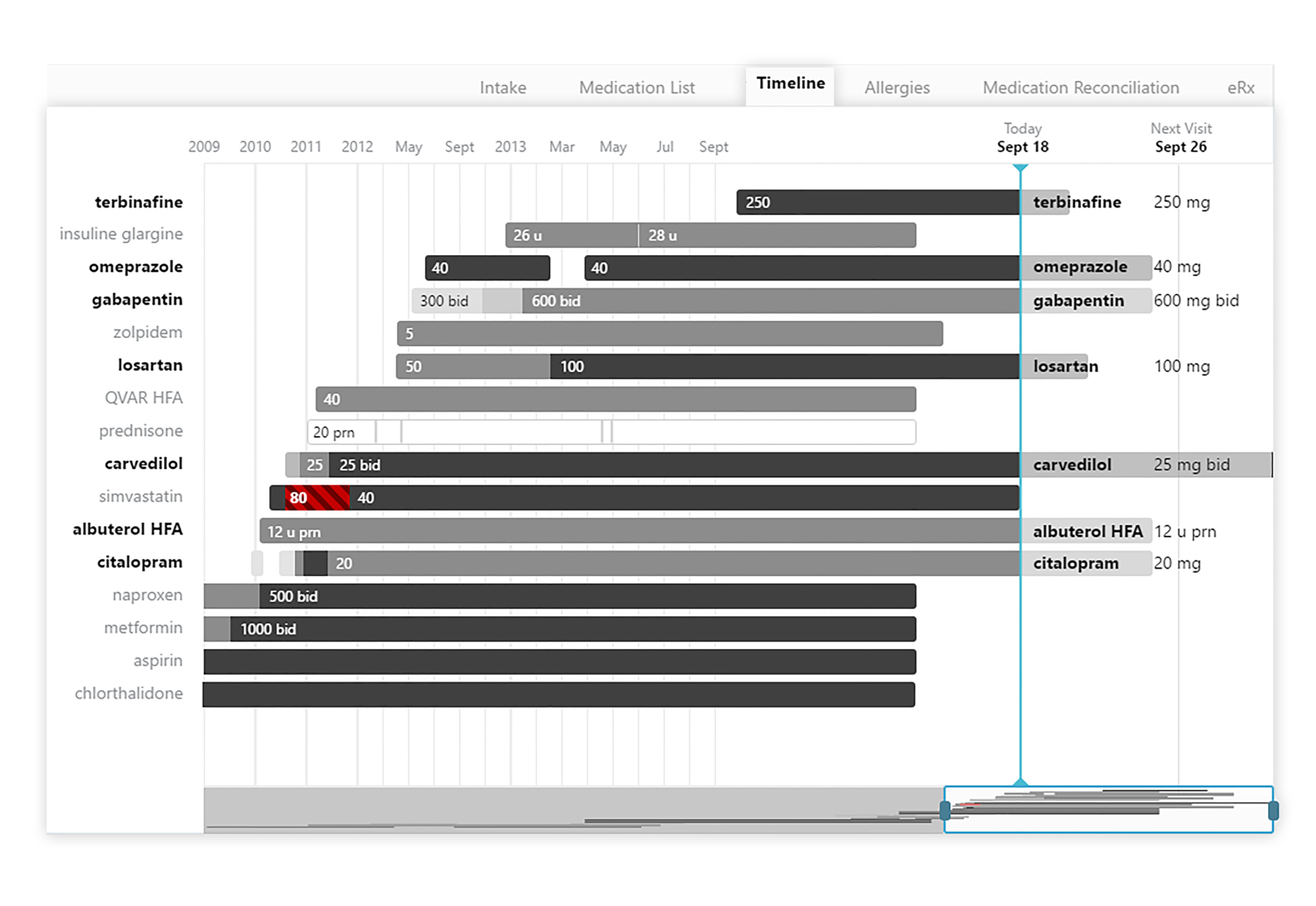
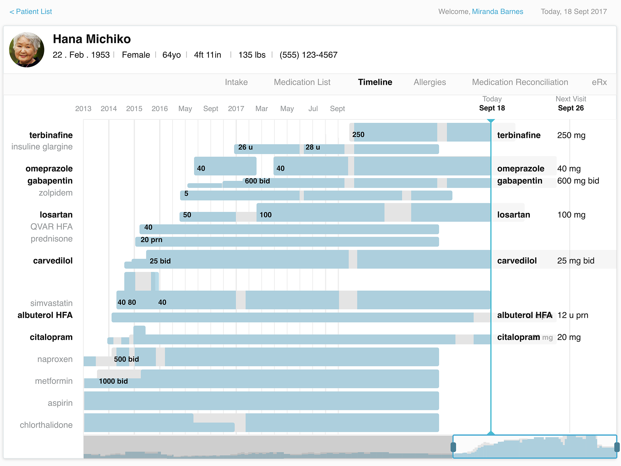
Typically, a physician may be seeing a patient for a small handful of specific needs, and it can be difficult to see the larger picture of the patient’s life. A person may have several care providers tending to different health concerns, and those providers don’t always have a clear idea of what another is doing or why, and patients don’t always know or think to tell their cardiologist what their dermatologist is doing and vice versa. We designed our medication timeline to be easily scanned and provide “situational awareness” to any provider, as well as to quickly reorder the list to the medications they care most about. Miniature displays of the medication timeline give providers a quickly scanned visual reference to understand how long a patient has been taking a medication and changes in the prescribed therapy over a recent time period.

Patient history as a blueprint for providing care today
The medication timeline allows a provider to view medication history in greater detail, telling the story of our patient’s medical history. By looking at the past, a provider gets a picture of how certain conditions evolved over time, when treatments changed, what therapies worked, what didn’t, and why. The timeline is meant to quickly communicate dose strength with the use of shade, where lighter values are a smaller dose, and the darker values are a larger dose, and red with striping indicates when a prescribed dose is beyond the recommended maximum. The timeline is navigable and zoomable to provide deeper detail, with future concepts including notations, indicators for refill or renewal, and medication adherence.
Inspired EHRs: Designing for Clinicians offers inspiration and design principles to aim for EHRs designed with the clinician and patient in mind. Although it has been a while since the book was released, we still hear about it inspiring designers and engineers to push the boundaries of health IT to continue to improve healthcare.
Improvements
There are still many more topics in health IT to tackle and redesign for the healthcare workers who use them every day and for the patients whose health and wellness depend on them. Ideally, more chapters and volumes would follow, outlining more areas in healthcare that are problematic and how we might change our approach to address them. It has also been some time since this book came out. If I were to revisit, I would apply more of what I've learned over the years for accessibility, 508 compliance, and the entire experience of the health encounter.
For instance, a self-documenting encounter could greatly reduce physician burden, prescribing software could use a collection of patient history, preferences, and insurance information to add intelligent recommendations and further reduce cognitive load on the physician and the pharmacist.
Since the writing of the book, we've revisited the medication timeline and adjusted the design to account for patient adherence, which can get more complicated than "Did they or didn't they get a refill?" We took what we learned from our work with diabetes treatment tools to tackle a medication list that covers all medications across conditions. Because so much of health depends on what happens outside of the doctor's offce, we're interested in how much of the prescribed amount patients are using at multiple times of the day, and can use that data to assess whether this treatment is right, whether ill effects are due to their therapeutic regimen or external factors.

I would also revisit the e-book itself. Technology has advanced, and I have learned more about building apps since then. Today, I would use a React library like Jekyll or Gatsby to build a modular interactive e-book, that responds and adjusts to different browser sizes more easily, with a less obtrusive table of contents as navigation.
Get in touch!
Interested in collaborating or have a project in mind? Let's chat!